12.07.2023
Making optimum use of views
When does which view bring you the most benefit?
Zeitwart offers you various views to help you plan your bookings in the best possible way. On this page, we would like to briefly introduce you to the special features of each view and what each view is best suited for.
Calendar view
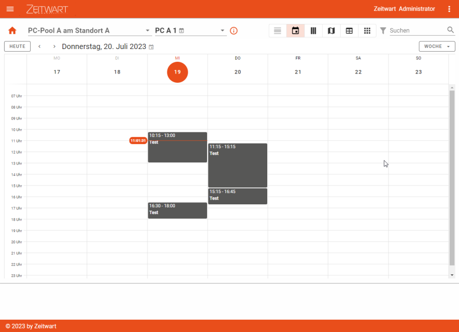
The calendar view is particularly useful for getting an overview of current bookings.
The view visualises bookings as blocks so that you can find free times as easily as possible and get an idea from the visualisation whether there is still room for your booking.
The view allows you to switch between the options "Day", "Week" and "Month" via a drop-down menu, whereby "Week" is usually activated as this option has proven to be particularly useful. You can use "Day" for fine-tuning - "Month", on the other hand, provides a rough overview and is particularly important for you if you manage resources yourself or would like to monitor utilisation for other reasons.
Calendar columns
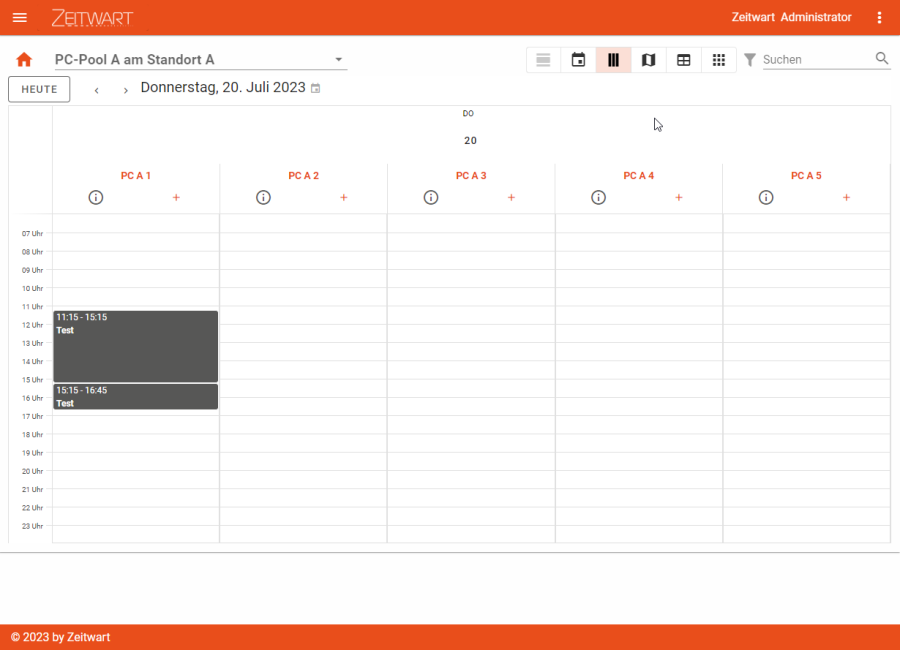
The "Calendar columns" view with its admittedly unwieldy name may remind you of the calendar view (above), but does not have an option for "Day", "Week" or "Month". This view also visualises bookings as blocks to make it as easy as possible to find free times.
Unlike the "Calendar view", "Calendar columns" is designed to display multiple resources. You can then combine these into one booking using the "+" symbol (to the right below the name) and also keep track of whether, for example, two resources that you definitely want to book together for your appointment are both available at the desired time.
Conference or training rooms with movable walls are a good example of this: If you want to book two such divisible rooms as one large room, you can do this via the "Calendar columns" view. The prerequisite is that you have the rights to do so and that you are allowed the necessary quota of simultaneous bookings.
Another good example is mobile inventory that you can add to a room or another resource. Depending on the context, this could be a mobile container or a smart screen, for example.
Map
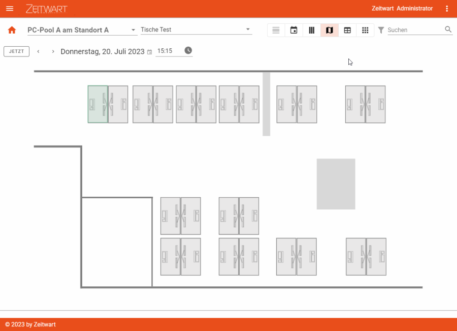
The map view in Zeitwart offers you exactly what the name suggests: a map with resources.
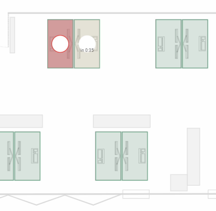
This view not only allows you to access the resources very intuitively, as you know exactly where they are located and how the other resources are distributed based on the map. It also allows you to see the current occupancy of the resources, whereby a distinction is made between three statuses: "green" corresponds to "free", "red" corresponds to "occupied", "yellow" means "soon occupied". While "red" bookings show you the start and end times when you hover over them with the mouse pointer, "yellow" bookings also show you when the next booking will start (e.g. "in 0:35" = the next booking will start in 35 minutes):
The core competence of this view in Zeitwart is the focus on the current occupancy or the current availability. The "Map" view allows you to find out more quickly where a resource is still available right now than the "Calendar view" and the "Calendar columns". The "Map" view is therefore particularly suitable for ad hoc bookings, while the other two views are particularly suitable for planned, future bookings.
A good example of using the map view is shared desk scenarios, as many of us are familiar with from work. The view allows you to find the best place for yourself on the map without having to memorise the room plans. Where this is enabled, you can even see who is sitting at the neighbouring desks and sit down with the people you want to work with.
Another good example of the use of the map view can be found at one of our customers: Rooms there are generally only booked 24 hours in advance. This can lead to gaps in occupancy on individual days, while at the same time there are people who still want to book rooms. Our customer solves this by enabling ad hoc bookings on the same day for certain users on site via the map view on certain devices. Thanks to the map view, those affected know immediately where they can find the booked room when they book.
Table
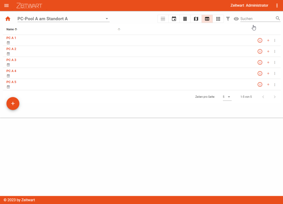
At first glance, the table view in Zeitwart looks very similar to the "Calendar columns" view (above) due to the "+" symbols for the joint booking of several resources, but in contrast, it does not display any bookings.
This view is particularly interesting for you if you manage resources yourself. In this case, you can access the administrative settings of the resources via the "three dots" menu (at the very back).
For all other users, this view is particularly suitable if they want to book a specific room or resource but do not care about the time slot and want to use the "Show available times" functionality. In this specific case, the table view is also suitable for these users as a quick way to book one or more resources.
Kacheln
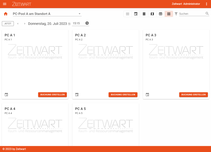
In Zeitwart, the tile view allows you to make resources bookable using a tile with a background image. The view is very low-threshold and primarily aims to present the resource as such, so that you immediately have an idea of what you are dealing with in the resource. In all other views, you have to click on the "i" symbol.
In return, however, this view does not give you any information about the location of the resource, as you would get from the map view (if available). This view also lacks any information about previous or future bookings. You will, however, be given an indication of when the next booking is due to start:
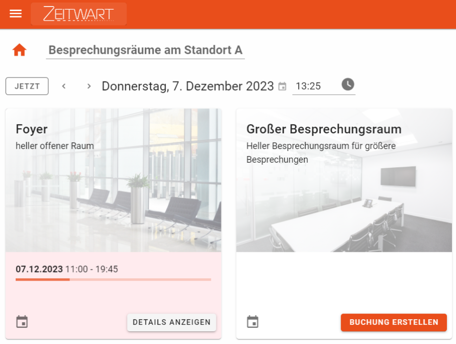
The tile view is particularly suitable as an entry-level view or for cases where you want to book a specific resource that you already know. Its strength is that you can book resources quickly and easily and select them based on a photo. By displaying upcoming bookings, the tile view also provides an overview of the current occupancy, as you already know from the map view.
Company car pools are a good example of the tile view. The tile view not only offers you images of the respective vehicles as a quick decision-making aid, but you can also quickly see whether the desired vehicle is currently available or which vehicle would still be available.